1. Describe how your views of the web and websites have changed so far?
Whenever I'm on a website now, I wonder how the site was created and I want to sneak a peak at the page source.
When I see the really "primitive" text-only research pages (that have a horizontal left aligned, one-columned table that's "the whole page"), I think, geez, these people are really creative. Why couldn't they add more columns to their tables and spice things up a little?-- which leads me to add, I realize that I also hate scrolling. It's nicer and simpler when you just have a nicely sized rectangle page where everything is confined to that window of space. It's less stressful.
0-- and lastly, now that I look at the web, I wonder what other beautiful sites are out there--and with what programs are they designed in. I am getting into "site-looking" and drawing inspiration from them and perhaps applying them to my own site.
2. What are you interested in learning more about as we go on in class?
I am interested in getting a better grip on tables and layouts in dreamweaver and just getting used to the code aspect of designing a website too. I'm looking forward to the bit of Flash we will learn and anything more interesting in Fireworks too. I would just like to get more familiar and used to handling these programs too.
3. What has been your greatest challenge so far?
I have just been designing things in Fireworks because of the wider range of typefac choices available so I would say it's kind of challenging designing in Dreamweaver. But I guess I just have to spend some more quality time with Dreamweaver. I noticed that the Dreamweaver stuff loads a lot faster too. I should stop using Fireworks for text. :(
4. What has been your greatest success so far?
My greatest success has been... (surprise!) Using/designing my pages in Fireworks! I love Fireworks. Like the above, I love the typeface choices. I just really like designing in Fireworks. Period!
--O, no wait! I would also like to add, just learning how to FTP stuff to the web, that's exciting stuff. That's exactly what I've been wanting to do this past summer but had no idea where to design a page and how to post it online. So that "prayer" of mine had been answered!
Well then, here are links to two of the three sites (the third being this blog) created this semester in the TIME Web Media course:
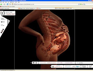
The Atherosclerosis Proposal site And
The Atherosclerosis site! This was the first version:
hereThat's all for now. Happy midterms, all.
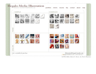
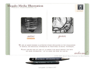
ps, Kristen, I did a little bit of extra work this semester-- I started working my own website-- a lot of it is still under construction but maybe this can count as... extra credit??? :D :D :D heehe
www.lindachao.comanyway, thanks!!


